
Analyzing WhatsApp Conversations with Python
I started using WhatsApp around five years ago and like most people it is one of the applications I use daily to connect with my family, friends and co-workers. One day I had the idea to analyze the conversations between my partner and I.
I was curious to find out the following:
- How often do we exchange messages?
- Who has sent the most messages?
- What month do we talk the most? Which month do we talk the least?
- What words do we use the most?
- Can I visualize our word frequency?
Starting the Journey - Gathering the data
The first step was to gather the data I require for my analysis. When you go into any conversation in WhatsApp you are have the ability to download your chat with the Export Chat feature.
The exported chat is exported into a txt file. When I first opened the text file I was initially shocked with the amount of information.
My partner and I talk...a lot.
Initial Observations
When opening the text file, every line of conversation using a new line break as a delimiter. Here is an example of one line of text from a conversation.
[2019-11-09, 6:03:41 PM] Gonzalo Vazquez: Ça va bien !
Within the brackets, every message is timestamped, followed by the author and finally the message.
First, we load the data into a dataframe using tab-stop as a delimiter.
from os import path
import numpy as np
import matplotlib.pyplot as plt
import pandas as pd
import datetime

# Import Dataset
original_df = pd.read_csv("data.txt", delimiter="\t")
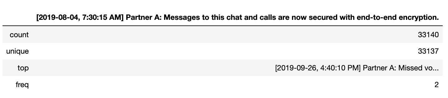
Exploring the data gives us an interesting view. We have 33,140 observations and one feature.
# Describe Dataframe
original_df.describe()
The next step is to clean the data and create a new dataframe with three columns(date, author and message)
# Define empty dataframe
df = pd.DataFrame(columns=["date", "author", "message"])

# Create a method to split each line into an object with date, author and message
def split_message(index, message):
    tmp_dict = {}
    tmp_message = list(message)
    tmp_message_2 = tmp_message[0].split("]")
    message_2 = tmp_message_2[1].split(":")
    tmp_dict["date"] = tmp_message_2[0].replace("[", "").replace("\u200e", "")
    tmp_dict["author"] = message_2[0]
    tmp_dict["message"] = message_2[1]
    return tmp_dict

# Loop through each row in Dataframe and copy each value into an observation
for index, row in original_df.iterrows():
    df.at[index, "date"] = pd.to_datetime(split_message(index, row)["date"])
    df.at[index, "author"] = split_message(index, row)["author"].strip()
    df.at[index, "message"] = split_message(index, row)["message"].strip()

# Print DataFrame
df
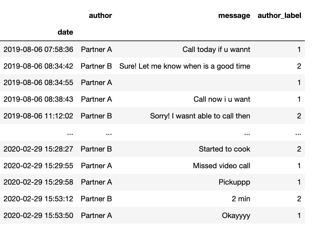
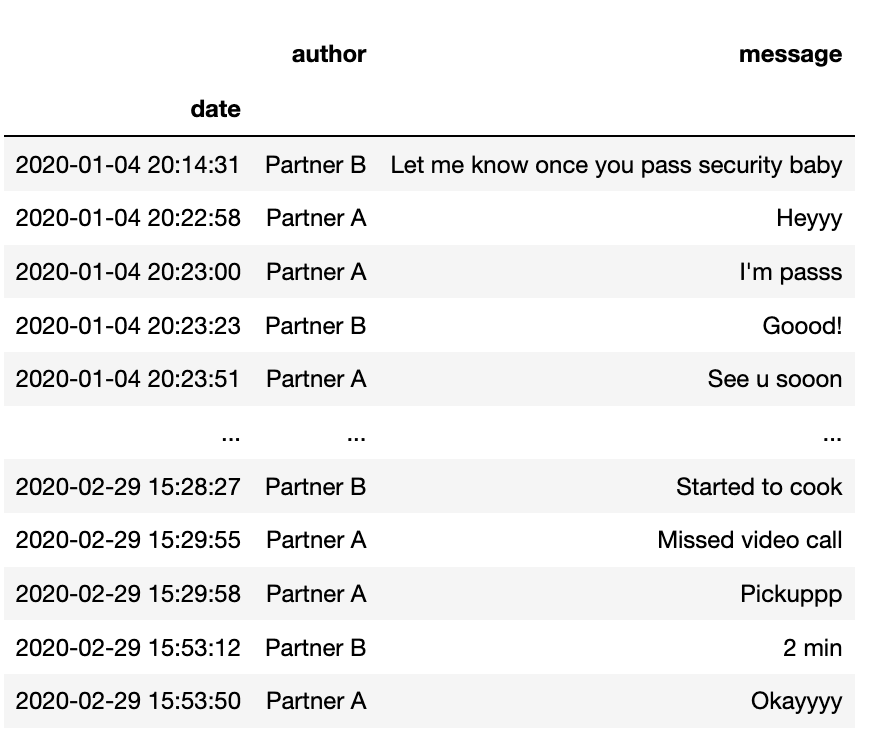
Now our data has three features and 33,140 observations. The next step is to delete the current index and set the date as our new index.
# Set df['date'] as the index and delete the column
df.index = df['date']
del df['date']
df
Now that we can have a date as in index, we can start to filter our dataframe
# We can now search by year - return 2020
df["2020"]
Analyzing our conversation
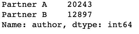
Now that our data is a dataframe with three features (date, author & message), let's start our analysis. First, let's get a count on the messages being sent by the author:
# Print the number of messages sent by each author
df["author"].value_counts()
Next, let's compare the messages being sent between 2019 and 2020.
# Number of messages sent in 2019
df["2019"]["message"].count()

# Output
>> 28241

# Number of messages sent in 2020
df["2020"]["message"].count()

# Output
>> 4899
Great! Finally, I want to be able to see the frequency of messages sent month by month. In order to accomplish this, we have to create a new column where we assign one or two depending on who the author is.
# Create a new column of 1 or 2 based on author - Partner A (1) and Partner B (2)
def label_author (row):
    print(row["author"] == "Partner A")
    if row["author"] == "Partner A":
        return 1
    elif row["author"] == "Partner B":
        return 2

df['author_label'] = df.apply(lambda row: label_author(row), axis=1)
Now, that we have a new column with ones and twos, we can sum all of them and plot them in a time-series graph.
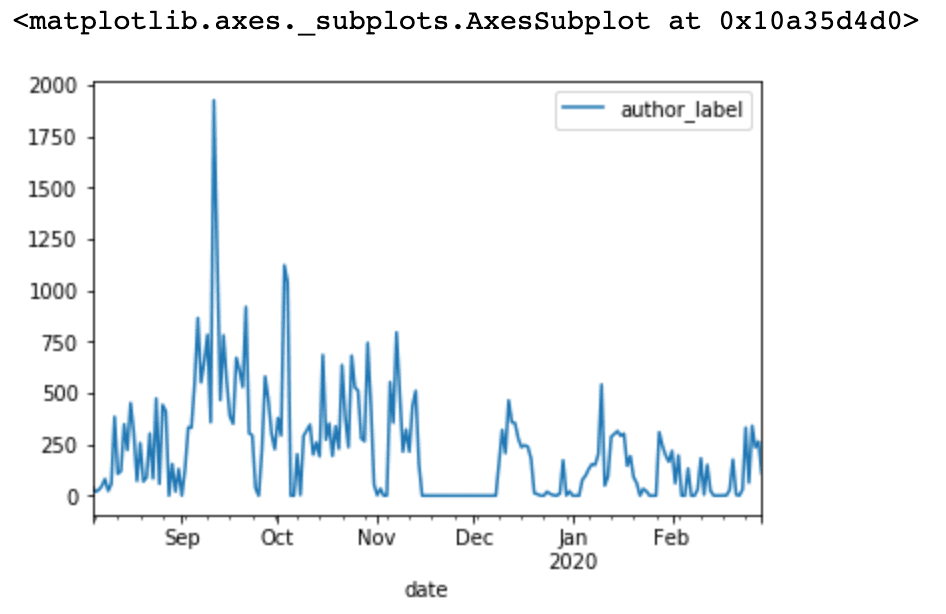
Voila! Incredible, we talked the most between September and October.
A graphical representation
Finally, we have two questions left to answer:
- What words do we use the most?
- Can I visualize our word frequency?
To answer the questions above, I turned to the ever popular word cloud. A word cloud is a visual way to represent text. Usually, the frequency of each word is represented in a different font size and colour. After some research I found this Python library, https://pypi.org/project/wordcloud/, that allows us to feed a text file and produce a word cloud.
# Loop through each row in Dataframe
# Extract messages and copy to text file
f = open("messages.txt","w+")
final_message = ""
for index, row in original_df.iterrows():
     final_message += split_message(index, row)
f.write(final_message)
f.close()

# Read file created
d = path.dirname(__file__) if "__file__" in locals() else os.getcwd()
# Read the whole text.
text = open(path.join(d, 'messages.txt')).read()

# Create wordcloud using Alice in Wonderland as a mask

# Get data directory (using getcwd() is needed to support running example in generated IPython notebook)
d = path.dirname(__file__) if "__file__" in locals() else os.getcwd()

# Read the whole text.
text = open(path.join(d, 'messages.txt')).read()

# read the mask / color image taken from
# http://jirkavinse.deviantart.com/art/quot-Real-Life-quot-Alice-282261010
alice_coloring = np.array(Image.open(path.join(d, "alice_color.png")))

# Load stop words file
text_stop = open("stop-words.txt", "r")
lines = text_stop.readlines()

stopwords = set(STOPWORDS)

# Set each line as a stopword
for line in lines:
    stopwords.add(line.strip('\n'))

wc = WordCloud(background_color="white", max_words=2000, mask=alice_coloring,
               stopwords=stopwords, max_font_size=40,
               random_state=42, min_word_length=4)

# Generate word cloud
wc.generate(text)

# Create coloring from image
image_colors = ImageColorGenerator(alice_coloring)

# Show
fig, axes = plt.subplots(1, 3)
axes[0].imshow(wc, interpolation="bilinear")

# Recolor wordcloud and show
# we could also give color_func=image_colors directly in the constructor
axes[1].imshow(wc.recolor(color_func=image_colors), interpolation="bilinear")
axes[2].imshow(alice_coloring, cmap=plt.cm.gray, interpolation="bilinear")
for ax in axes:
    ax.set_axis_off()
plt.show()

# Store to file
wc.to_file(path.join(d, "alice-colour.png"))
Finally, the result is below. Using Alice in Wonderland as a mask, we create a word cloud of the most used words in the chat conversation.
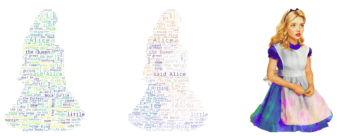
An important tip to remember is to provide a stop-words text file to the generator. The stop word is a new line delimited text file that has common filler words such as am and or that will be ignored by the word cloud generator.
I hope you have enjoyed my blog post and I encourage you to follow me on my learning journey as I share my experiences with you.